Benchmark relative mortality/morbidity measurement and attribution over the four years of the C19 scamdemic

In my early career in the investment management industry, I led a team responsible for the compilation of investment performance of large sovereign wealth and other government funds.
At the time, simply calculating the “rate of return” on investments was an issue. These were the days of punch cards, tapes and rooms full of disks – the processing speeds are now replicated in a cell phone. Cell phones can access lots of stuff but cannot gran lots of data and massage it into usable analysis.
Actually, scrubbing the data clean of errors was a large part of the job, the reports used by the governments and the investment managers were viewed via particular dimensions and formats – “lenses” – for monthly and concatenated monthly reports for desired longer than monthly periods.
The dimensions od reports were currencies and sectors within currencies expressed in the local currency (currency of investment) and accounting currency (the currency of the government entity that owned the investments),
These performance reports allowed the comparison between the many different investment managers given the same benchmark portfolio and discretion.
Later another concept emerged that refocussed the measurement of performance not just o these “absolute” return comparisons to focus more on “relative” performance against the benchmark = so that the strengths and weaknesses of each investment manager in each currency and sector could be identified and governments and sovereign wealth funds could re-allocate their assets to the nest investment managers and reduce exposure to those with poor performance. As an aside, I then went into direct management of investment funds, followed by interbank broking and lastly the investment arm of a consulting actuary.
It occurs to me that the principles of measuring the performance of investments – rates of return – are directly transferrable to measuring the mortality of the population AND morbidities in the population.
The data should be easily extractable on an annual basis – the CDC already churns out most of the data needed for this sort of analysis. The issue is that it is not correct.
Rather than a matrix of many currencies and many sectors, the dimensions could, say, be causes of death by age cohort – these could be further broken down by ethnicity or gender. or income bracket. This can be completed by ay special interest or advocacy group with their own “axe to grind” and can be used as evidence in any legal proceedings.
The advantage of this is that differences relative to a benchmark are additive and sum to the total of deaths or morbidities,
Choosing the benchmark is important – in a perfect world you might be able to tap into accurate monthly data over 5 or 10 years, for each category. Few countries have the quality or diligence to produce returns monthly, though many produce annual numbers.
(Side note: where do the 6-10 million criminal immigrants fit in?!?)
As the work of Denis Rancourt has illustrated – mortality is not debatable – though there are differences in official numbers and how they are attributed to actual date of death or the date the death was reported. The benchmark used to compare actual morbidity would need to reflect trends in rates of death also. The more detailed the analysis. The more issues such as migration of people from one cohort to another have to be taken into account.
In investment terms the actual return is straightforward. Closing value – opening value – purchases plus sales = return. The (usually monthly) rate of return requires the calculation of an average value that equals the sum of the opening value plus a weighted cash flow). Divide the return by the average value and you have the rate of return for the period.
The calculation of mortality data at the total level does not require any adjustment of the migration of people through the age cohorts, but the migration through the age cohorts does require such a calculation to get to the weighted average number of people – by year.
Here I hope you can see the framework for benchmark relative mortality emerge. The first step is to calculate the benchmark – by selection of age cohorts by cause of death – possibly built up from ethnicity and/or gender that sum to the total for each age cohort.
Next you would need the same data for the measurement period in question – the C19 period.
Armed with the benchmark and the actual data for the C19 period, it would be a straightforward task to compare the actuals with the benchmark to highlight areas of concern by any dimension/”lens”.
This sort of analysis can be done for ay country. I have used the US for ease.
The total excess deaths for the US is easy to visualize. You will have heard reference to there being 158,000 excess deaths in the first 9 months of 2023. I believe this is a vast understatement of the true order of the catastrophic number of American killed over a longer period.
From here:
United States Deaths 2023, How Many Deaths in United States 2023 | Dead or Kicking
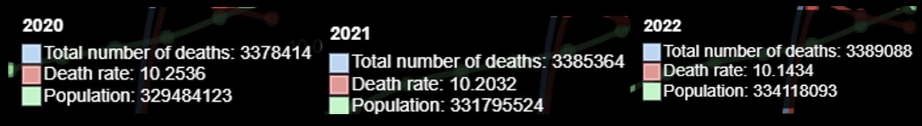
Just looking at 2018 and 2019 the number of deaths per thousand population – just to ballpark the numbers.

The rate of deaths per 1,000 population were 8.7.
Now look at 2020, 2021 and 2022
For 2023, the numbers are inn the top left of the link to “dead or kicking”.
Deaths 3,354,001 – Population 336.563,555 for a Death rate of 9.9654
The average Death rate over these four years was 10.1414, compared to around 8.7 for 2018 and 2019 – an increase in the rate of death of 16.6% FOR FOUR YEARS.
Given the number of annual deaths of around 2.85 million in 2018 and 2019, an excess of 16.6% represents excess deaths of around 490,000 each year for four years – 1,958,500 more deaths than should have occurred.
The “official” C19 dearth count over the four years to end 2023 was 1,120,545, but here’s where the “dirty pool” of the WHO kicks in.
The WHO instructed the CDC to treat any death that occurred within 28 days of a positive RT-PCR test as a C19 death. The RT-PCR test was bogus and tens if not hundreds of thousands of Americans were killed by “treatment protocols” such as Remdesivir – still occurring today.
Evidence from other countries compiled by the likes of Denis Rancourt indicates there was no significant change in mortality. In other words, the excess deaths in 2020 in the US were not C19 related.
Check out this table for the extent of the falsification of US mortality data. (I extracted this CDC data around a year ago and it may have changed).
Just the top 11 leading causes of death in the US:

Since the C19 mortality data is bogus, it means that the vast majority (95%?) should be allocated to other leading causes of death. (Note this is not even necessarily the primary cause of death – just the cause of death typically ascribed – someone may have died of a heart attack after a loud explosion for example).
The true impact of the denial of treatments such as anti-biotics, the murder of the elderly with Remdesivir, etc, will be hidden in the C19 buckets.
Intentional falsification of data.
Now consider the compliant CDC following WHO instructions to categorise any death within 28 days of a “positive” RT-PCR test and compare that to the classification of deaths following the experimental C19 injections of spike venom.
The vast majority of VAERS death reports (vastly under-reported) occur WITHIN 28 days. There is a 14-day gap between first and second doses and people were not consider “vaccinated” until 14 days AFTER the second dose – a total of 28 days.
COVID Vaccine Data - OpenVAERS

The x-axis is a progression of single days drom date of injection.
In a sane world, we would know the full extent of deaths by these injections of spike venom and there would NOT be a category of C19 deaths, instead there would be categories for Remdesivir, neglect, psychological torture and physical torture (starvation and denial of fluids whilst restrained).
So, there you see the measurement problem resulting from the falsification and mis categorisation of mortality.
Each of the leading causes of death can be benchmarked – if the data is accurate AND for a really deep dive, each of the disease categories can be measured for morbidities as well.
Without the elimination of fraud and the accurate representation and collection of data, the conversation will be a political one.
A true characterization of the mortality would break down those experimental C19 mRNA injections of spike venom by dose as the “lens”. One matrix for each of “unvaxxed” then another for one dose, two doses, three doses etc AND by manufacturer.
Then there would be a true diagnoses and analysis of cause-and-effect of a relative basis against a benchmark.
Lastly, the next “generation” of benchmark relative mortality/morbidity measurement and attribution would be “risk adjusted”. That is a whole new issue. In investment markets, it is usual to adjust EXCESS performance rates of return for the EXCESS risks taken to achieve those excess returns – this shows the excess return per unit of risk and is called the Information Ratio.
Now, the “risk” is expressed as one standard deviation of returns – which captures just two thirds of all observed returns and takes no account of skewness or kurtosis in the distribution of returns. It is more usual to represent “value at risk” at a given level of probability and time period. The calculation of relative returns in the investment arena is now considered trivial, so basic as to be handled by a simple computer program that grabs valuation and transaction data and churns out a result. This is how backward the mortality statistics would be considered in the investment world.
Onwards!
Please subscribe or donate via Ko-fi – any amount from 3 bucks upwards. Don’t worry and God Bless, if you can’t or don’t want to. Ko-fi donations here: https://ko-fi.com/peterhalligan - an annual subscription of 100 bucks is one third less than a $3 Ko-fi donation a week!
"The average Death rate over these four years was 10.1414, compared to around 8.7 for 2018 and 2019 – an increase in the rate of death of 16.6% FOR FOUR YEARS."
Pretty similar in Oceania (OZ and NZ).
I'm far beyond quibbling about what evidently amounts to cold blooded carnage. Wake up or not. If one no longer has a choice about WEF/WHO mandated shots applied with the compliance of your GOV/MOH and imposed with the enthusiasm and blind thuggery of local Lice and Military, there surely is little remaining beyond the ringing cry of 'bring it on' as people rapidly discover they have nothing left to lose?
Calculating death count from the mRNA jab is further complicated by the fact that it destroys the immune system, causing HIV, which takes years to kill and is always fatal. The NYT calculated that 72% of the world is jabbed.