Zooming in on NZ mortality data – 80-84 year olds by month and gender – what happened in the autumn and winter of 2022?

The buzz around the NZ whistle blower, Barry Young’s data has died down somewhat,
As you look through, you can multiply the numbers by 66 to get to US equivalents, b8 u for Canada, 5 for Australia and 14 for the UK.
I took a look at NZ mortality data by year, age and gender here:
It had this table of deaths by year and gender up to September 2023 taken from here:
Monthly-death-registrations-by-ethnicity-age-sex-Jan2010-Sep2023.xlsx (live.com)

The data is publicly available information and I had hoped that some data whizzes would have dived into it and maybe tried to correlate it with the roll-out of injections by age group in other tables I compiled that zoomed in on elderly age cohorts that explained the majority of excess deaths.
Here are the “extra deaths” per elderly age cohort for males and females by calendar year.
No feedback has surfaced, probably because of “so what’ism!) so I have gone a little deeper using my little lap top, my Excel skills and a magnifying glass!
Here are the male and female deaths by month and year for just the 80-84 year cohort, which had the highest “extra swaths” above the 2015-2019 average number of deaths.

I don’t know the timing of the vaxx roll-out for this cohort, but let’s look at the data:

Apologies for the busy table, Let’s look at a comparison by month and gender of the 2015-2019 averages against 2020, 2021, 2022 and 2023 data that runs to September 2023 Keep in mind there are reporting issues about whether the deaths were reported in the month they occurred or the month they were reported.
These numbers are not adjusted for number in the 80-84 cohort – that is, not deaths per 1,000, so are a starting point for deeper analysis in that context. They will not be impacted by the large numbers of immigrants into NZ over the 9 years as it is unlikely that immigrants will be this age.
First the men:


And now the ladies:
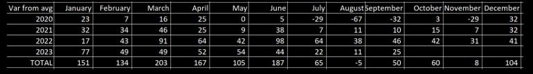
Now, the totals include 2020 to cover the entire period of the scamdemic, but the data shows that, for men the most significant months, are March, April, June and August of 2022, plus 3 of the 4 months in the run-up to September 2023.
For women, March, April, June and July of 2022 are the most significant months.
March, April and June 2022 for both. Not so much 2021, but the autumn and winter of 2022.
I don’t have the demographic breakdown and timing of doses administered of the vaxx roll-out. Maybe it is in Barry Young’s data. This might help narrow down any issues with the administration and relative toxicity of doses.
This sort of analysis can be done for each age cohort to go even deeper into the data, perhaps some data whizz can do that? Sort of a heat map of extra deaths per 5 year age cohort by month?
Onwards!
Please subscribe or donate via Ko-fi – any amount from 3 bucks upwards. Don’t worry and God Bless, if you can’t or don’t want to. Ko-fi donations here: https://ko-fi.com/peterhalligan - an annual subscription of 100 bucks is one third less than a $3 Ko-fi donation a week!
Wow, what a blip that is for those two years coincidental with the vaccine!
Thanks for this sleuthing.
Is the reason it is so low in 2023 due to the fact the vax culled all the vulnerably old?
And in 2020 - the year of the greatest scamdemic the world has ever seen - and completely "unprotected" as we all were, we had LESS deaths than the year before.
This was a made-for-TV mini series.
We should HAVE DONE NOTHING.